

Launching a new mobile platform used to mean convincing people to download an app. Today it means convincing them to stay past the first minute, and that is a much harder job. Users have already tried thousands of apps, they expect fast loading and familiar gestures, and they have little patience for anything that feels confusing. For a platform with no reputation yet, user experience is often the only evidence people have about whether it is worth their time.
Table of Contents
Small Screens Leave No Room for Error

Small screens shape behaviour in ways that desktop design never had to deal with. There is room for only a handful of options at once, and people often pick up their phones for a few seconds between other tasks. Nielsen Norman Group’s research on mobile usage has repeatedly found that sessions are short and easily interrupted. In one of its earlier studies, the average mobile session lasted about 72 seconds, roughly half the length of a desktop visit. A new platform that needs a long tutorial before anything useful appears is working against those habits.
Trust, Discovery and Speed
Discovery is another pressure point. New platforms rarely have brand recognition, so many users arrive through comparison pages, reviews, or word of mouth. If you want to see how one such service organises its listings, the Casinous new-casino section is a useful example of how readers now research fresh launches before they commit. You can visit this website to browse recent additions and compare what each one offers. Gambling should always be approached with care, so check your local rules and set limits before playing anywhere.
Speed is the other half of first impressions. Google’s Core Web Vitals guidance on web.dev describes a good loading experience as Largest Contentful Paint within 2.5 seconds, Interaction to Next Paint at 200 milliseconds or less, and Cumulative Layout Shift at 0.1 or less, measured at the 75th percentile of real page loads. These numbers matter because a platform that stutters when someone taps a button feels unreliable, even if its content is excellent.
Designing Before the First Launch
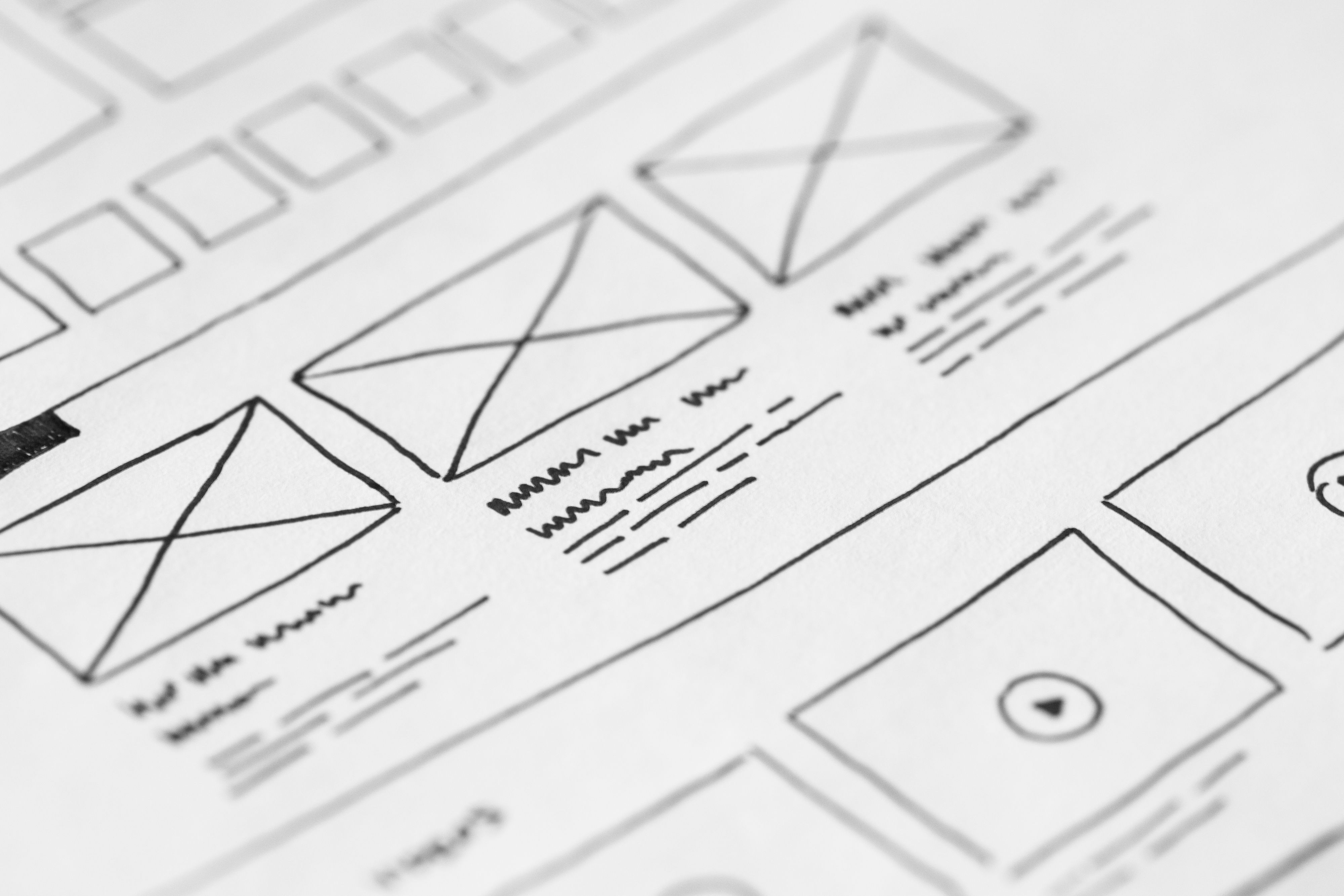
Good mobile experiences usually start on paper. Wireframes let a team test the flow of sign-up, search, or checkout before a single line of code is written. A rough sketch makes it easy to spot where a user needs three taps to do something that should take one. Fixing a pencil line costs almost nothing, while fixing a shipped release means updates, support tickets, and users who have already decided the product is not for them.
Interruptions Are the Normal Case
People rarely sit with a phone and nothing else to do. A message arrives, a call comes in, or the bus pulls up at the stop they were waiting for. Designers should assume that users will leave mid-task. Saving progress, keeping form data, and making it easy to return to the last screen are small features that signal care. Nielsen Norman Group’s review of the state of mobile UX noted that most sites and apps now offer a reasonable experience, yet overlays and in-app browsers still tend to be buggy and can leave people confused about where they are.
Clear Navigation and Touch Targets
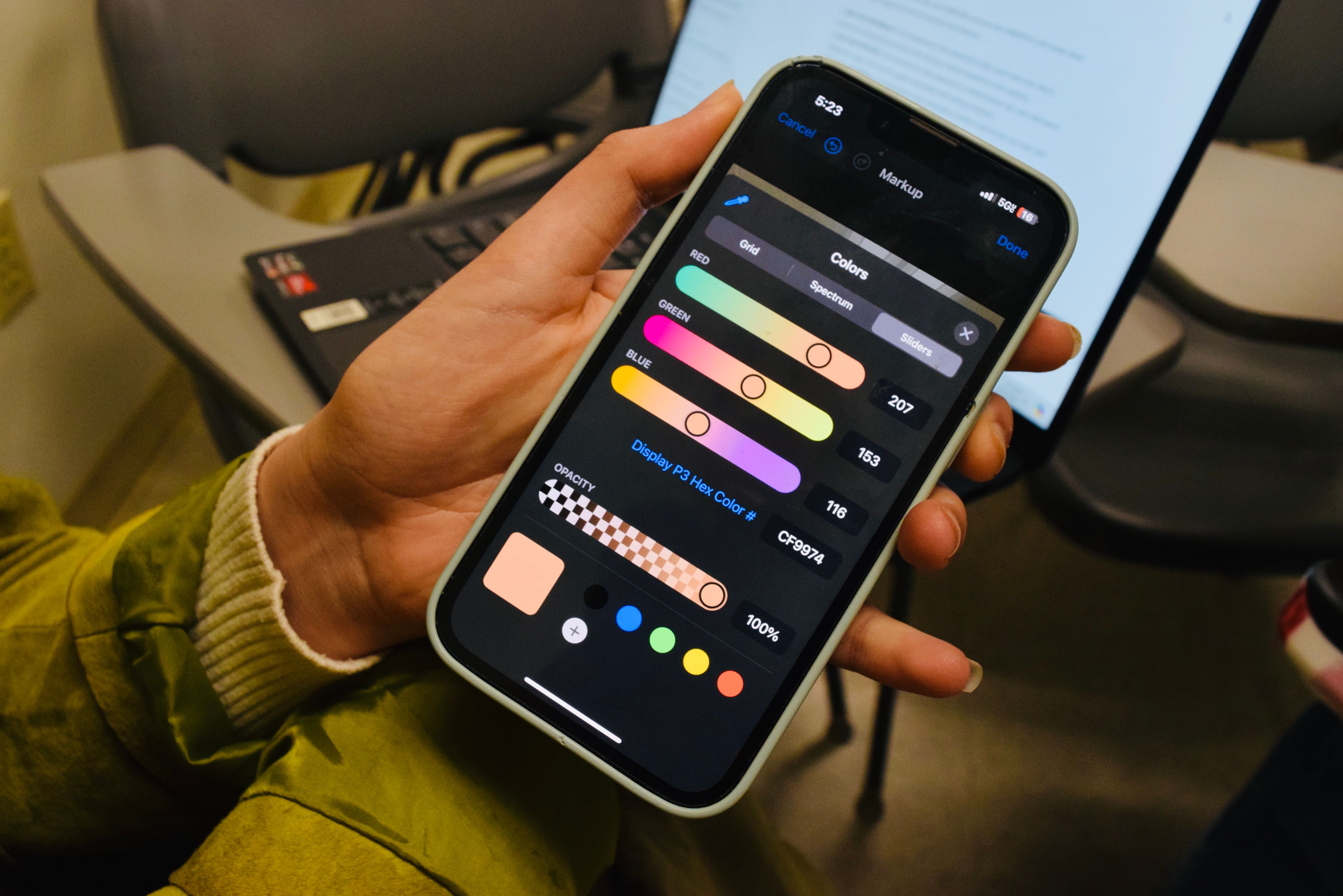
Navigation has settled into a few familiar patterns, including bottom bars and the hamburger menu. Familiar does not mean perfect, though. Touch targets need enough space for thumbs, labels should say what they do, and the most important actions belong within easy reach. Someone comparing options on a small screen makes many choices in a row, and each one that feels awkward nudges them toward closing the app.
Measuring Experience Beyond Downloads
Download counts are a poor measure of whether a platform is working. A better picture comes from what happens after installation: how many people finish onboarding, how often they return within a week, and which screens generate support questions. Field data from real devices is especially valuable because lab tests on fast hardware can hide problems that appear on older phones and weaker connections. Teams that review this information regularly tend to catch regressions before users start leaving reviews about them.
Designing for Foldables and What Comes Next
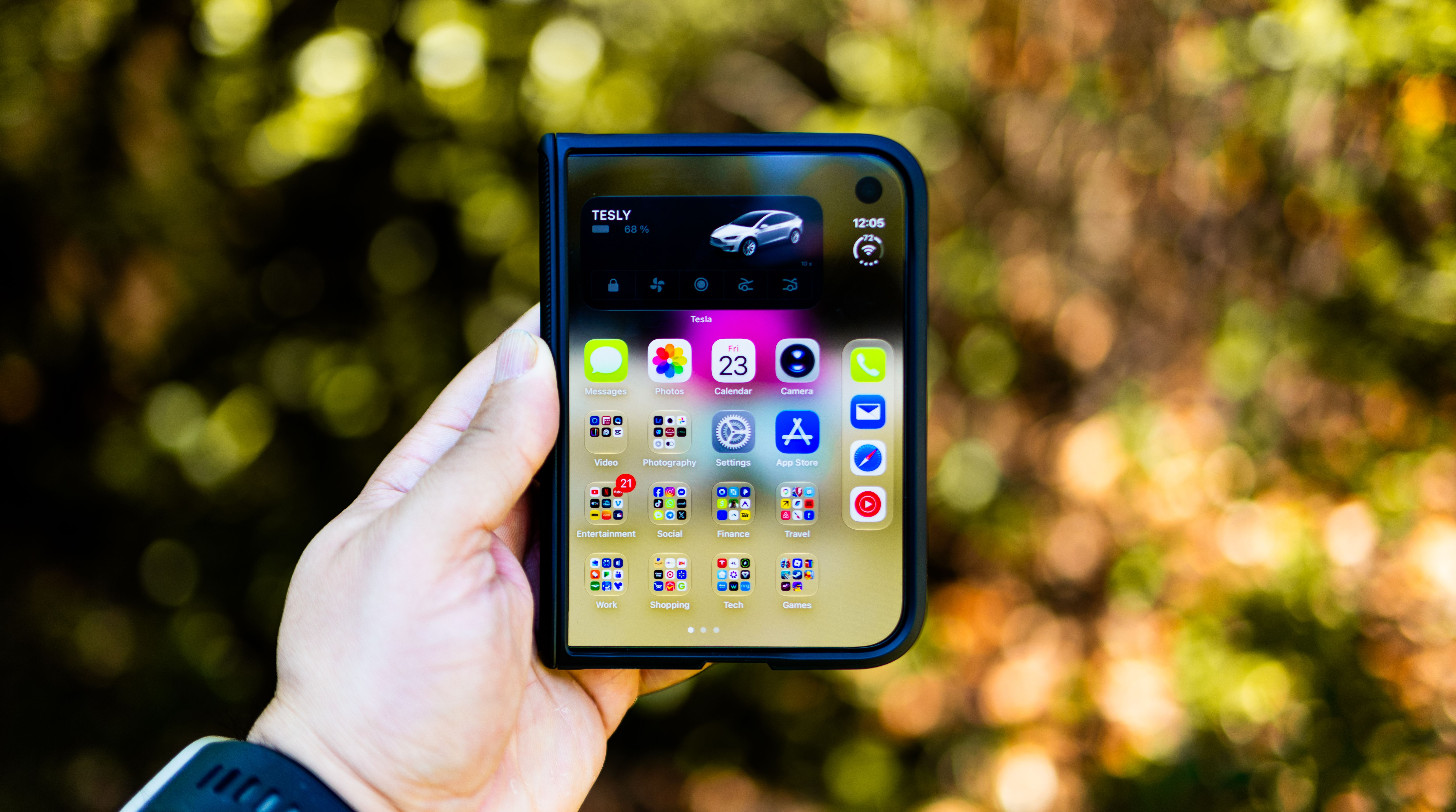
New hardware keeps changing the rules. Foldable phones can shift between a narrow cover view and a wider inner screen, and users expect the content to follow them without losing their place. A platform designed only for one screen size will feel fragile on these devices. Designers need to think about how layouts reflow, how apps resume after the screen unfolds, and whether controls stay where people expect them.
New mobile platforms will keep arriving with new hardware and new habits. The teams that succeed will treat usability as a launch requirement rather than a finishing touch. Start with the smallest version of the experience, watch real people use it, and let what you learn shape the next release. In a crowded market, the platform that feels effortless is often the one people keep.